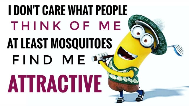
When we first encounter a brand, whether it’s an ad on Instagram or product packaging on a store shelf, our brains begin making assumptions about it.
Certain “looks” speak to our subconscious in ways we can struggle to describe.
Yeti’s chunky logotype feels masculine and practically indestructible. While Disney’s logotype evokes a childlike playfulness, born from the brush script signature of Walt himself

Because our brains are pattern-making machines, we take in this information and subconsciously categorize brands based on what we see.
If the design looks a certain way, it must be THIS kind of product.
But what if the design is a sloppy mess?
What if the colors clash, the fonts are illegible, and the images and illustrations seem like they came out of Microsoft Paint’s clipart collection?
We know that type of design too.

Maybe we categorize this amateurish design with the visual language of high school PowerPoint presentations (ahh, sweet memories).
Perhaps the screaming-bold font and primary colors remind us of a local payday lender’s signage (eww, sketchy).
Maybe this design looks like a meme your Aunt Sue shared on Facebook (see above… yikes!)
Either way, sloppy, amateurish graphic design causes us to lose trust – and a lack of trust makes it incredibly difficult to build a brand.
Brands, after all, are best described as someone’s gut reaction to your product or service. Your true brand is what people say about it when you’re not around.
When you’re not there to advocate for your brand in person, your touchpoints (website, packaging, ads, etc.) must make a positive first impression.
What does the quality of your design say about your brand?

